
Field has Marking Menus
Field supports menus" (a.k.a Pie menus, a.k.a radial menus, a.k.a that thing that Maya does).
We like them a lot. They have all that slick fluid interaction feeling of gestures but are self-revealing. Arguments for them can be found here, but the basic idea is to do what menus do but better. If you have everything in a menu (which is either a big long list or a shorter list with sub menus) you have two problems: one — menu items are kind of small (and there's classic HCI research that tells you that small things take time to 'hit' with a mouse); and two — they are all in a row so your hand can't "learn" where things are (anybody who plays a musical instrument will know exactly what we're talking about here).
Marking menus arrange their "menu items" in circular patterns so that your hand can remember where they are and the items themselves are huge (semi-infinite in fact, just like the menu bar in OS X).
In Field — OptionClicking
Marking menus have already been in Field for the last few months in one place — OptionClicking (we'll update that page once beta 9 is live). But we now have a generic system for building marking menus and, a little like Maya, marking menus that pop up menus, for when you want to cluster things together and forego some of the benefits of the "pure" marking approach.
The new start and stop menus for OptionClicking look like this:
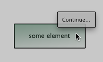
We are using up / down rather than right / left since we quickly learned that that the marking menu tended to get in the way of scrubbing long elements with the mouse.
When you actually move your mouse onto the "zone" (which is really anywhere "North" of that line:
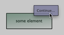
The area turns blue. At this point you are still holding 'option' and the left mouse button. If you release either of these that's it, you're done, you've selected "continue....". The point is that you can now option-click and "flick" up with the mouse without really paying much attention.
"Stopping is down" is the metaphor, and the muscle memory:
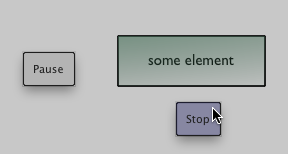
The "space" menu
Finally, it wouldn't be Field if you couldn't extend it with your own stuff. Enter the MarkingMenuBuilder:
builder = MarkingMenuBuilder()

builder.marking("Extras", "NE")
builder.subtitle("Even more Yum")
builder.add(u"\ua49e <b>Pear</b>", lambda : 0)
builder.add(u"\ua49f <b>Peach</b>", lambda : 0)
builder.add(u"\ua4ae <b>Plum</b> - <i>(really)</i>", lambda : 0)

_self.spaceMenu_ = builder
This adds a new "menu" to an element, one that pops up when you hover over it and press space. Go over to the "extras" zone and wait a beat (or hit the rectangle itself) and:
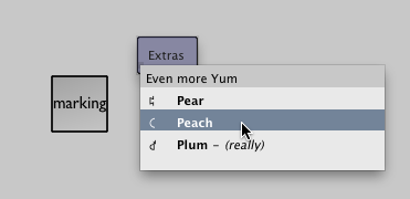
A menu appears. With a little more code like the above you can take this where it needs to go:
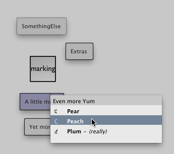
Some things to note about Field's internal menu-making code:
- Field looks for a leading character at the start of the menu item to use as an icon (which it typesets a little differently). We grab these things off the "character palette" from the OS. \u2192 gets you a right arrow for example. OS X comes with a crazy number of symbols hidden here.
builder.marking("Extras", "NE")— "moves" the builder to making an northeastern menu called "Extras"builder.subtitle("Even more Yum")— adds a menu title (something that you can't select, it's just there for descriptionbuilder.defaultMenu()— adds a menu that is open automatically (just like the right-click menu example we gave above).builder.add(label, callback)— adds a menu item with the text 'label' which calls 'callback'. Thoselambda : 0is just a function that really does nothing at all. In practice you'd have:
def myWonderfulFunction():
    print "wonder"

builder.add(u"\ua49e <b>Wonder</b>", myWonderfulFunction)
Finally, one comment — _self.spaceMenu_ concatenates up the delegation graph so you can use boxes with sub-boxes to get more complex menu structures.
While Field will be adding marking menus (mainly to the plugins) to augment the right-click menu, we're pretty sure that the spaceMenu_ will remain completely reserved for your own uses. Extend and experiment...