on biped
_ chapter by Kaiser in_ La Scena Digitale, an Italian anthology on technology and art, 1999.

In 1997 I had invited Merce Cunningham to collaborate with Shelley Eshkar and me on a project that we had already roughly conceived — a virtual dance installation called Hand-drawn Spaces. The following year, Merce returned the favor by inviting us into his process. Merce had started choreographing a new full-length dance, which he had decided to call BIPED, a name of special significance to us. “Biped” had been the working title for the alpha and beta releases of Character Studio, the figure animation software we had used to choreograph the virtual dance of Hand-drawn Spaces. Biped was as apt a term for Cunningham’s choreography as it was for the software, for Merce’s lifelong interest has been to figure out all that a body on two legs can do.
Cunningham’s method of collaboration is famous for being unusual. Perfected in the 50s with his principal collaborator John Cage as well as with Robert Rauschenberg, Jasper Johns, and others, the idea is to expunge all traces of illustration from the three main strands of the dance: the choreography, the music, and the visual décor. No longer was dancing to illustrate the music, or visual décor to illustrate the dancing, and so on. The three strands were to be conceived independently and then united for the first time at dress rehearsal or even opening night.
Merce usually gives his collaborators just a phrase or two about his own intentions. For Biped, he had told the composer (Gavin Bryars) and the visual artists (Shelley and me) that it was “about technology” and would be like “flicking through channels on TV.” As his independent collaborators, we understood that we were free to follow up on these little hints or to ignore them altogether. Gavin Bryars opted for the latter: his score turned out to be a lushly continuous piece of music, beautiful and even romantic, with nothing technological about it — yet somehow perfectly suited to the dance that he had never seen before.
stage previsualization
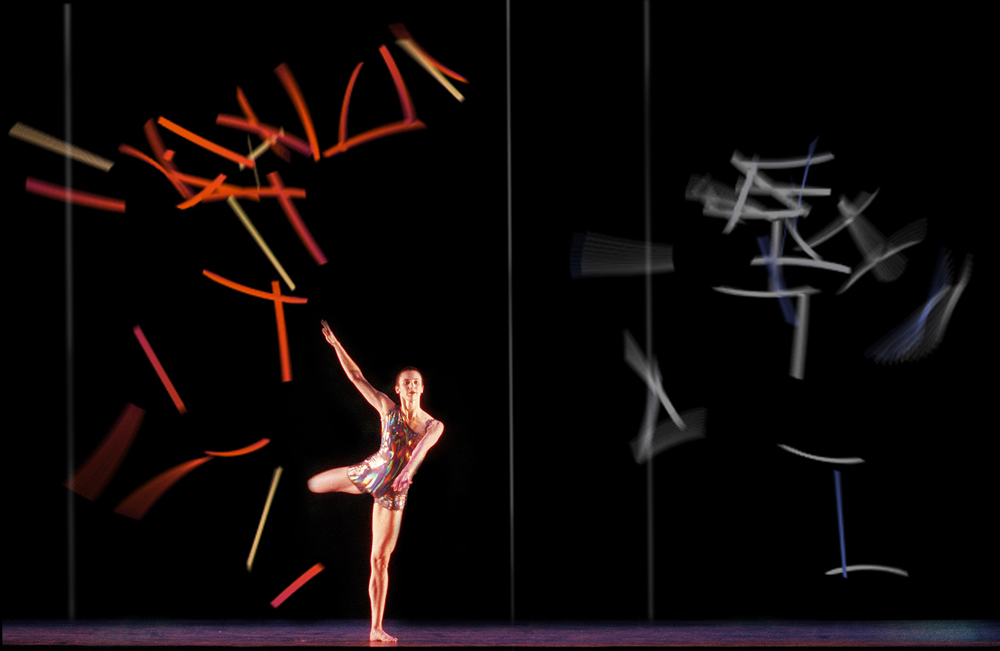
For the visual décor, Shelley and I built on the projections and virtual choreography we had started exploring with Merce in Hand-drawn Spaces. Working with Cunningham’s lighting designer, Aaron Copp, we decided to use a huge transparent scrim to cover the entire proscenium stage. Our projections would fill the scrim, behind which the dancers would perform. Costume designer Suzanne Gallo created marvelous costumes with an iridescent metallic sheen so that the dancers would not be lost in this huge spectacle. Instead, they would shine in the light both of the stage and of our projections.
Next we decided to create roughly 25 minutes of animation, slightly more than half the length of the dance. These were to be discontinuous sequences, ranging in length from about 15 seconds to four minutes. Merce agreed to this idea, and added one of his own: that the order of these sequences be determined afterwards by chance operations. So, when we were done, we gave Merce a list of sequence titles and durations, and he rolled the dice to establish their order and timing, which was then fixed.
But how to create a coherent structure when its order was unknown to us? Shelley and I pondered this question carefully, and decided that if we could derive our sequences from a core set of visual principles, they would make sense in any order given. This was akin to the musical structure of theme and variations, except that our theme would not be stated at the outset but would rather emerge in the variations.
[ ][3]
][3]
homage to marey

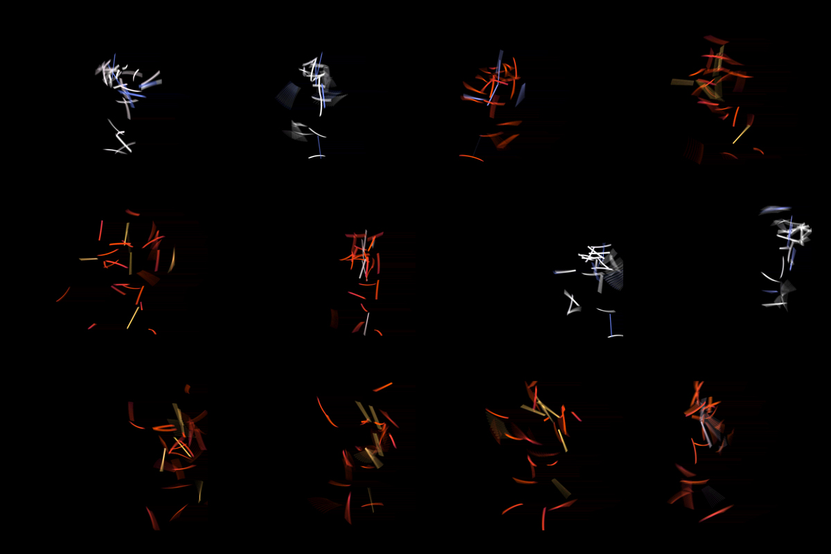
Actually, we had two themes in mind, one for figure and the other for ground. For the figure, we wanted to create a much larger variety of virtual anatomies. These included variations on the hand-drawn bodies we had made for Hand-drawn Spaces, but they also went far beyond that. We had dot bodies (from the dots seen in motion-capture), stick bodies (inspired by the yarrow sticks cast by I Ching practitioners like Cunningham and Cage), and cubist/chronophotograph bodies (our nod towards Marey and Duchamp). Having motion-captured about five minutes of the BIPED choreography, we now 9 used it to animate our figures much more freely than in Hand-drawn Spaces. Freely, but still truly: we took care never to lose the underlying perception of real and plausible human movement.
stick-figure sequence

A case in point: when our stick figure leaped, its various lines were flung upward in the air, then gathered back together again on landing. While no human body could do this, you could still feel the human motion underlying the abstraction.
For the space or “ground” of our projections, we thought to create variations of straight lines and of the planes they implied between them. If for Hand-drawn Spaces we deployed three screens to get three different picture-planes, we realized that we could create many more such planes within a single screen. For example, if we were to put three vertical lines in perspectival depth, then we could imply that the three different planes between the lines formed picture-planes — and malleable ones at that, for by moving the lines we could animate the planes. Thus we could create virtual projections within the actual projection, making for an intriguing perceptual complexity.
forest

This was especially true when we varied the degree of transparency and occlusion of these different elements: sometimes our black ground would read as a clear space into which anything might suddenly enter, while at other times it would mask whatever might be behind it.
Our projections were united with the choreography and music only at Berkeley, where BIPED premiered. By a miracle of chance operations, one of the first dancers on stage (Jeannie Steele) was haloed in a projection of her own motion-capture — “as if I were dancing inside myself,” she said afterwards. Merce had created a special effect of his own, with dancers seeming to materialize upstage as they emerged through hidden entrances into the light. One’s perception of the dance and of the animation began to intermingle, each becoming a lens that one could hold up to the other. BIPED was complete.